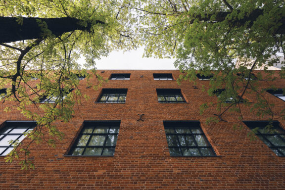
20-04 MODO STORE
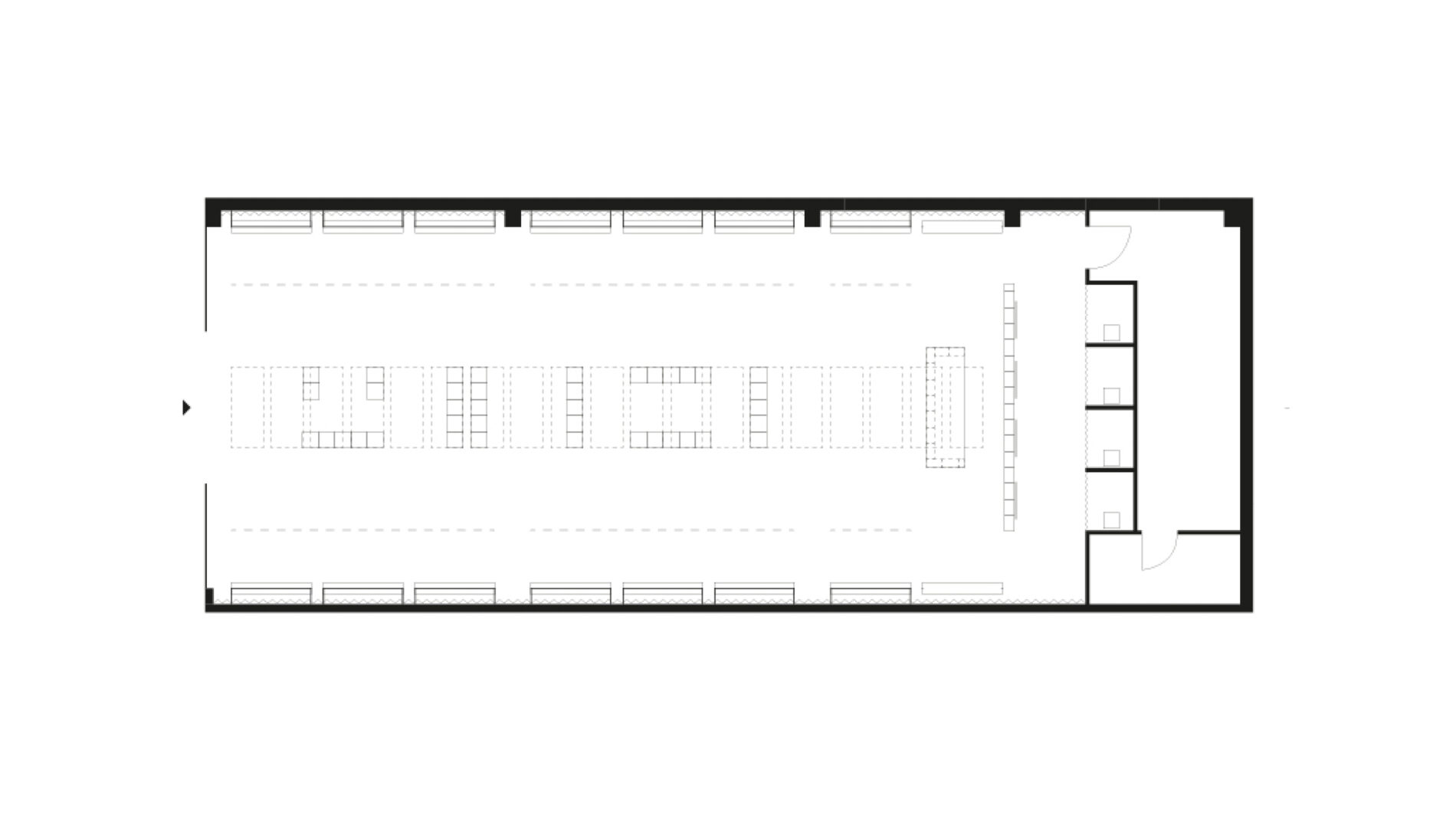
The architectural concept for Modo store is rooted in the unique identity of a local retailer specializing in Scandinavian brands and iconic fashion. The interior design highlights a modern interpretation of Northern simplicity while also embodying cultural richness through the use of authentic, locally sourced materials. This 220-square-meter space serves as a platform for showcasing both men’s and women’s fashion along two main walls, designed in a linear system that respects the proportions of the space, allowing customers to explore the products freely.
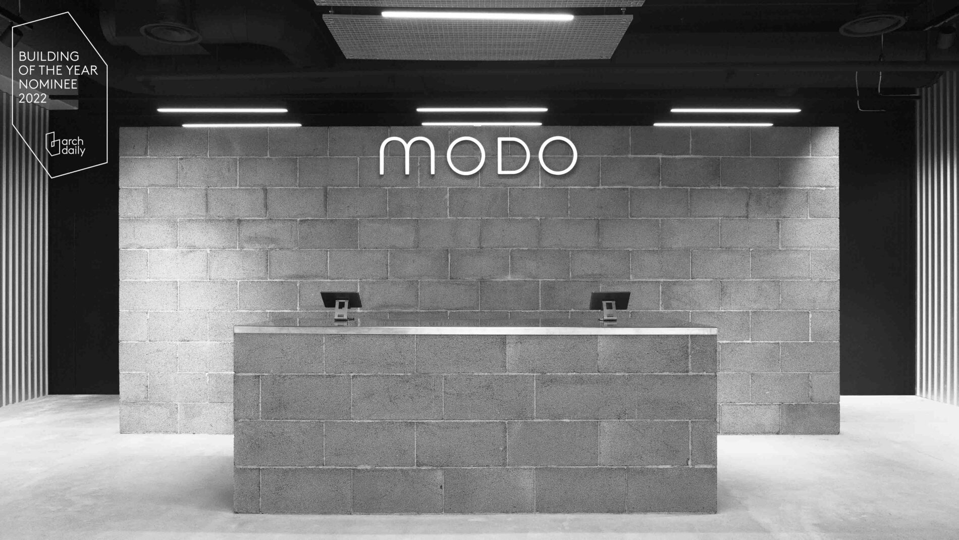
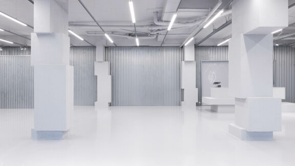
The design explores the interaction between materials, textures, and light, creating a dynamic environment where forms and product traces fluidly blend. The neutral, monochromatic background serves as a canvas that harmonizes new additions with elements that existed prior to the renovation. By using common materials in conjunction with extraordinary fashion items, the store’s space becomes unique and memorable.
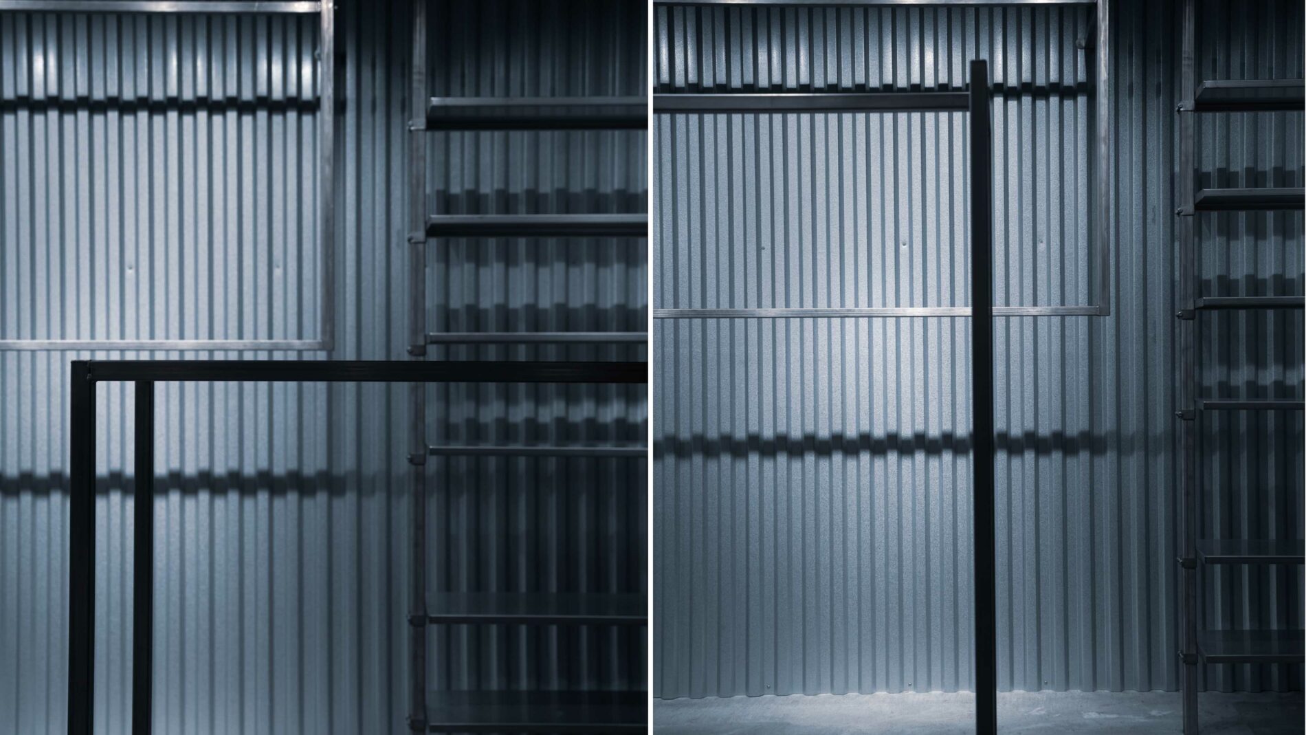
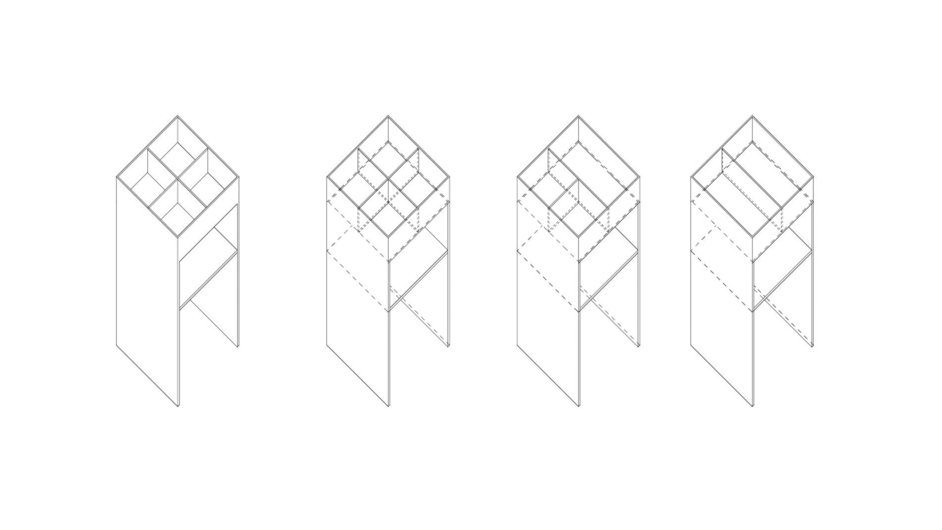
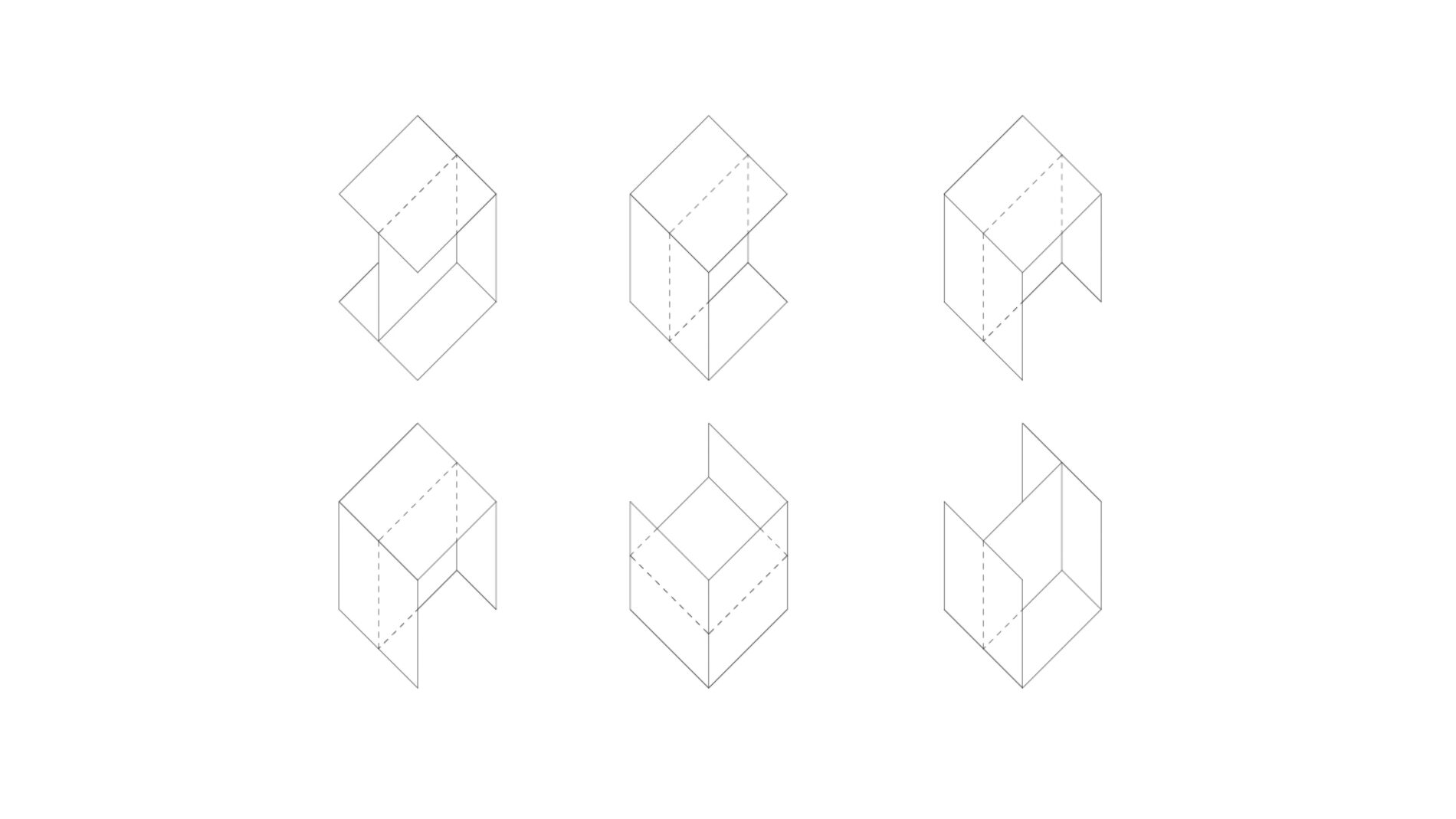
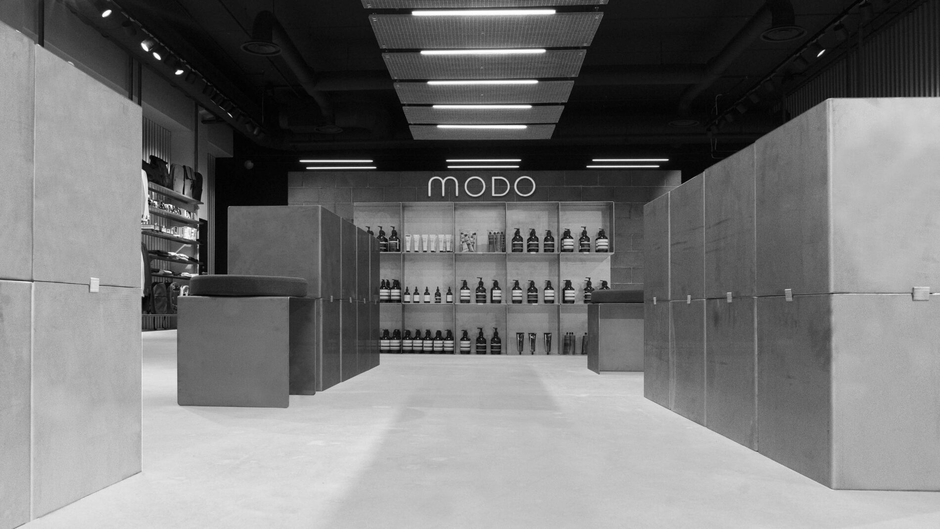
At the heart of the space are custom-made stainless steel modules, positioned in various configurations, which can be rearranged to free up space for special events. This flexible approach to store design is a response to the growing trends in online shopping, offering an engaging, adaptive environment that resonates with modern consumers.
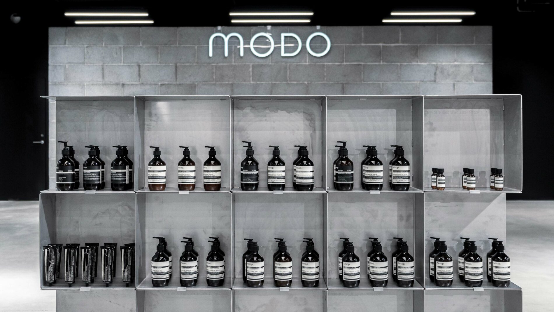
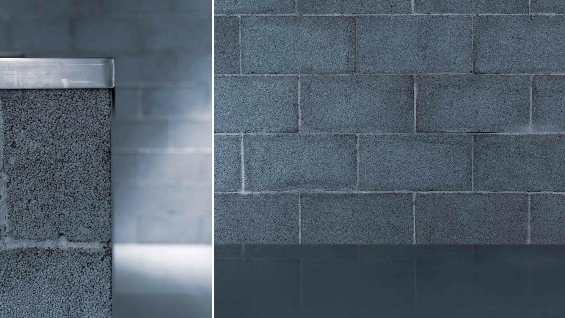
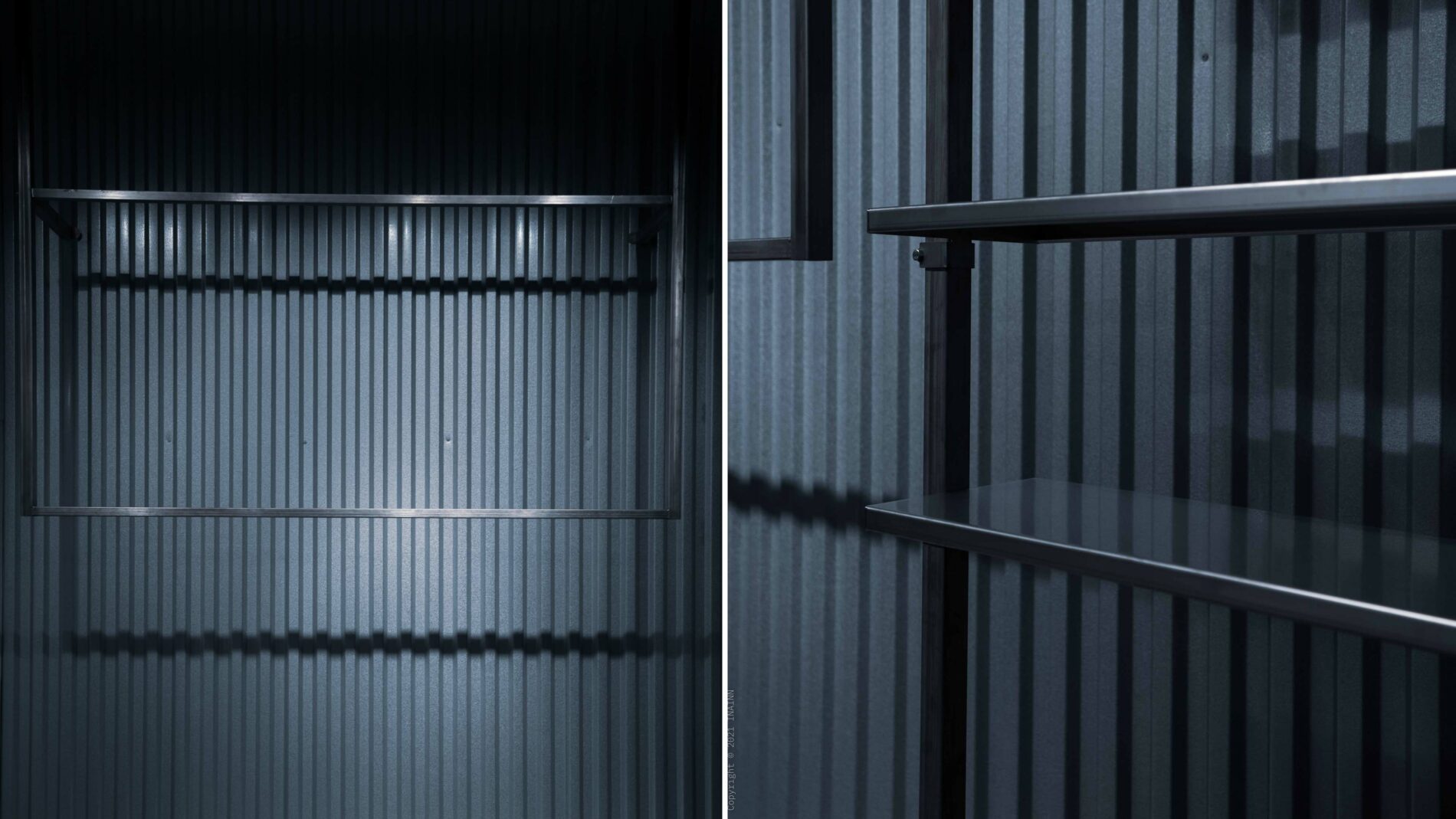
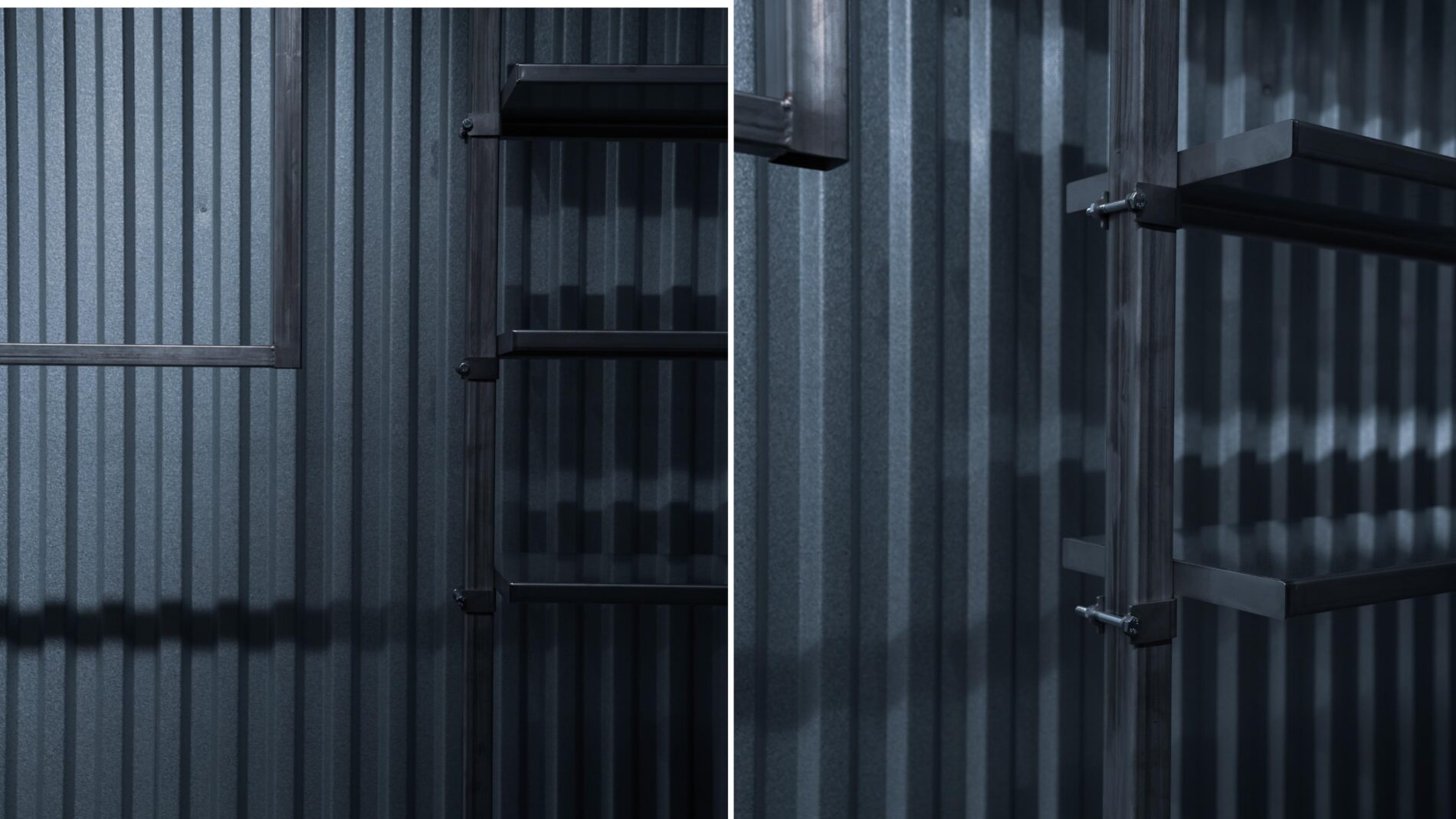
The store integrates existing prefabricated construction elements with mass-produced materials such as corrugated steel sheets, steel trusses, and concrete bricks. This chain-production effect is also evident in the bespoke stainless steel tiered shelving and hanging systems for clothes and accessories, which align with the existing structural system, enhancing its architectural significance.
The store’s steel curtains form a partially concealed facade that hints at the products inside, creating an atmosphere of mystery and discovery. The centrally placed entrance, aligned with the store’s main axis, invites deeper exploration, where a brick curtain wall conceals fitting rooms that serve as a social hub and a popular spot for Instagram-worthy moments, amplifying the store’s virtual presence.
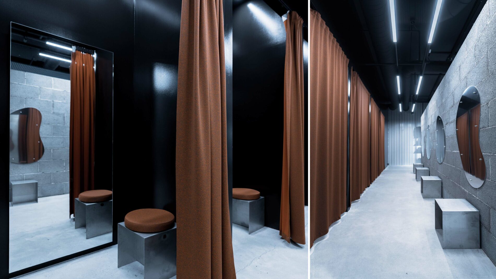
The overall use of locally sourced materials and Greenguard-certified textiles from the Danish company Kvadrat adds a sustainable dimension to the store’s interior design. The concept emphasizes using new materials only where necessary, combined with existing, renewed elements to avoid unnecessary overproduction. This coherent architectural vision is not only aesthetically refined but also aligns with the latest trends in sustainable design.
